Archives for category: botanical art

IMG_1333_crop

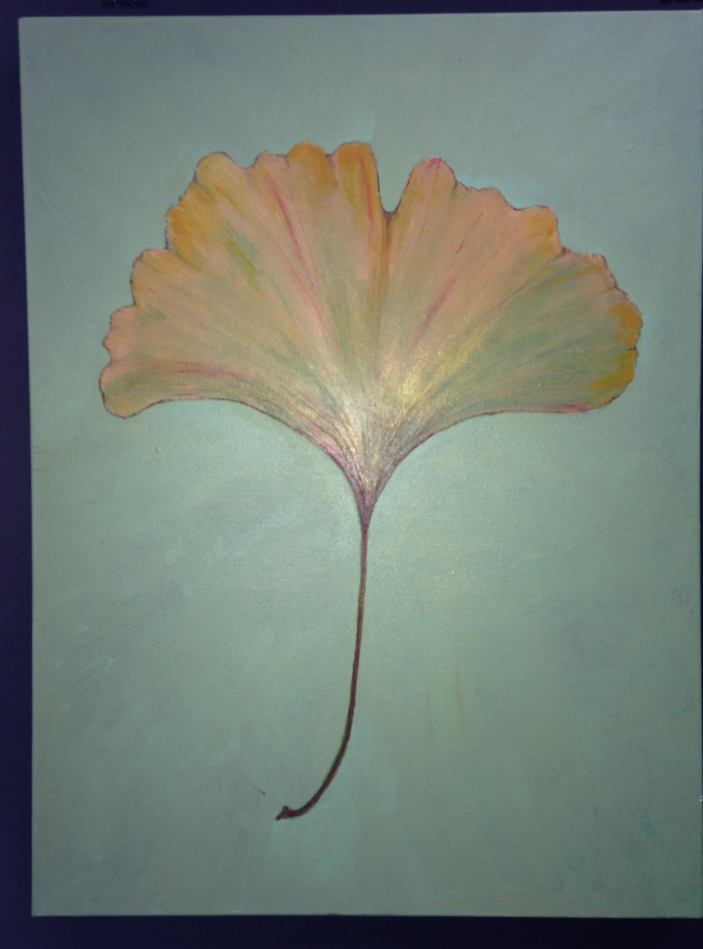
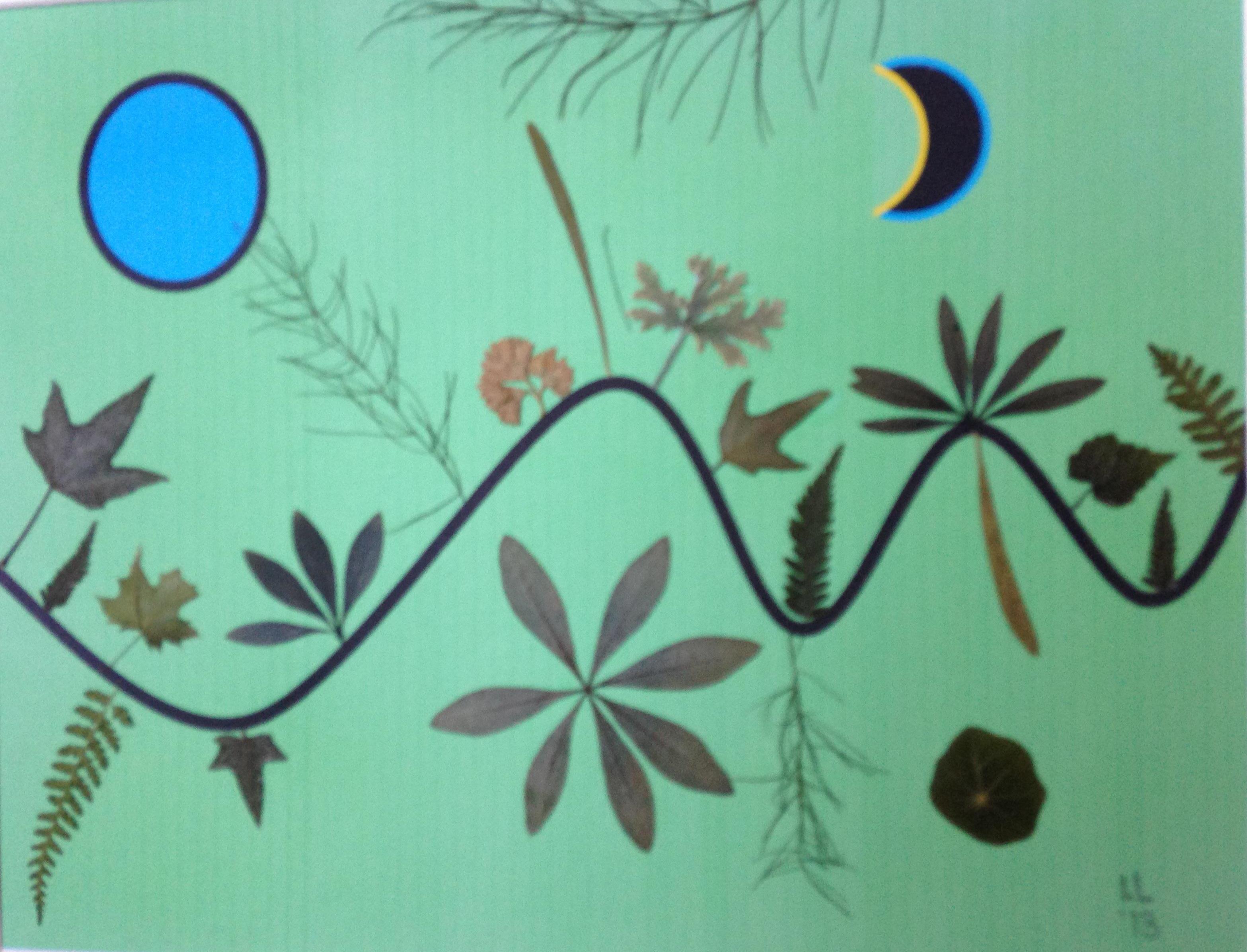
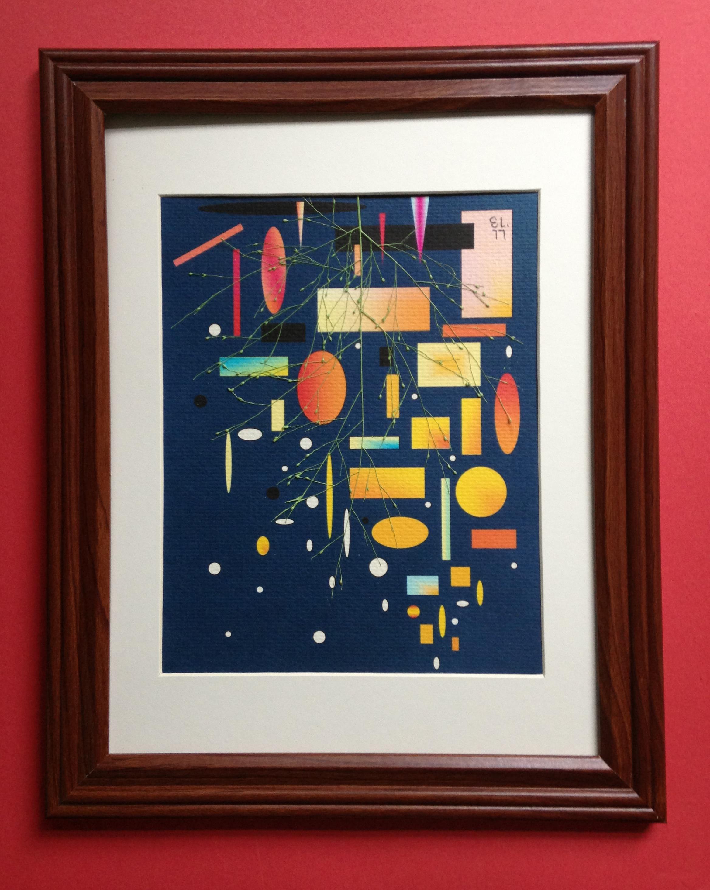
It occurs to me that while I often make mention of projects in the works and talk about process, I have never posted a photo of an unfinished piece until now

Today I am working on a companion piece to the scented geranium and fig leaf pairing I posted earlier in the week.

I prefer to begin these paintings by blocking in the negative spaces. Although I did so in this case as well, my plan was to show the geranium, this time, in summer colors rather than in the soft tans it turns to in the pressing process. The variety in my garden is variegated with light yellow to white ruffled edges and I needed to see it on canvas before settling on a final background color. The dark raw umber that I chose after blocking in the leaf will serve well to bring out its contrasting colors.

As the work goes along, I will add layers of pigment gradually reducing the degree of transparency you see both in the background and foreground at this early stage. It seems fitting that the background be the color of the rich soil this plant grows in. When I turn my attention to the space left for the ginko leaf, the background color will now dictate the shades of chartreuse that I choose to represent the spring colors of that lovely tree.

015_crop

IMG_1330_crop

As winter sets in, I’m going back and forth between creating new graphics for my sizeable harvest of ivy, ginkgo, and dozens of other plants, and using those same leaves as inspiration for a new series of acrylic paintings that mirrors my pressed botanical compositions. I love the freedom of choosing color schemes and degree of detail in the paintngs. I’ll bring about ten of them to the Velvet Mill in Stonington on December 28 and January 4th. Hope to see some familiar faces there. Others will pop up on Etsy soon or on request.

IMG_1270_crop

In between working on my pressed botanicals, I have decided that my winter project will be a return to some painting. In years past I have concentrated on landscapes and portraits, but now I plan to stay with my botanical theme. Don’t know yet how the series will develop. The image above is 18 x 20 and features ginkgo — one of my favorite leaves. I’d almost forgotten how quickly the process of painting makes me lose track of time. That’s a good thing unless it’s 2:00 AM on a work day.

Looking forward to meeting friends at the Yellow House on the 24th.

IMG_1264_cropIMG_1241_crop

With nearly 30 original pieces now on display at the Yellow House in Stonington Borough, the pressure is on to make some work for my next commitment in Providence on November 17. The first ginko of the year is ready to go with lots more in the wings so I worked on this combination in muted tones and added just a bit of pastel to highlight the lovely natural ribbing in the ginko leaf.

IMG_1091_crop

Lots of people ask me questions about how I protect the color of my leaves.

The first thing I point out is that many of the leaves I used in my botanicals have already changed colors by the time the pressing process is complete. Still more, like the andromeda in the example above are harvested at various times during the season specifically to achieve variety within my collection from a single plant.

While many leaves stay close to their harvested colors during the drying process, others do not. Chartreuse sweet potato vine, for example dries to a chocolate brown with clearly visible darker brown veining. Scented geranium dries to a variety of shades from light tan to dark taupe. My first principle,then, is to embrace these changes.

Still, some plants are more likely to continue to change after mounting than others. While such changes do not detract from the beauty of the compositions in my mind, I still take steps to preserve my original colors. First, after mounting leaves on my graphics, I paint them with a specialized dried material preservative that includes UVA and UVB protenction. Next, I spray each finished composition with an acrylic finish before matting and framing. This also contains a layer of UV protection and prevents fading of the botanicals as well as the underlying graphics.

These steps, along with the use of acid-free papers, adhesives, and matting ensures that the compositions retain their beauty for many years.

IMG_1171
IMG_1166_crop
IMG_1188_crop

Now that the outdoor artisan’s, markets have closed for the season, I’m turning my attention to replenishing my inventory and showing my work in more traditional ways. First will be the popular Yellow House coffee shop and restaurant in my home town of Stonington, Connecticut. I’ll be showing there throughout November. For anyone unfamiliar with our little village, it is a perfect place to spend an autumn afternoon with a stroll along Water Street past the shops and restaurants and down to DuBois Beach at the Point. The water views are almost 360 there and there is plenty to keep you busy. The Yellow house has been a favorite of ours for breakfast and lunch since my grownup kids were little. Gargain hunters with discerning tastes shouldn’t miss FUN! It’s filled with little luxuries you never knew were such necessities!

While we haven’t had a killing frost yet in Stonington, the growing season is definitely over. As always, I missed a few harvesting opportunities, but took in a very good supply of ferns, ivies, ginko, sweet potato vine and grasses. I’ll be spending next week managing my hydrangeas and gearing up for a few holiday shows including the November 17th version of the upscale Providence Flea which has just moved indoors.

Winter will also give me a chance to return to brush and canvas — this time to compliment my real botanicals. Can’t wait to get started in earnest!

IMG_1091_crop

IMG_1094_crop

I am keenly aware of the change of seasons as they impact my garden. Lately I have been keeping an eagle eye out for changes in my plants. Some mean that I must harvest or lose. Others mean that if I stay vigilant, I’ll have the opportunity to harvest fresh leaves in a color they only display for a few weeks each year. Nasturtiums come quickly to mind — especially since I love to use them as suns and moons and many of them turn brilliantly yellow before they begin to wilt from the cold.

I made these two small pieces to celebrate autumn. The quote by Camus is one I love not only because of what it says about fall, but also because it expresses my belief about the sometimes forgotten parts of flowering plants. Although I do occasionally use flowers in my work, my primary medium is foliage.

The second piece rounds out the series of landscapes I have built over the last few months. This one is meant to represent daybreak. the moon is still visible but the sun is about to burst about the horizon. The ‘tree’ in the foreground — in reality, a scented geranium leaf — is bare of leaves, yet the grass is still green and the hills in the background, spotted by evergreens, have not yet turned from blue to wintry gray.

IMG_1085_crop

IMG_1084_crop

I don’t always start out with a theme in mind for my botanical collages. Just as often, I am simply experimenting with arranging elements and colors for my graphics and plants with which to build a pleasing collage. In this case, however, the composition immediately skipped my thoughts past this infant autumn and brought me to winter. When I thought the piece was finished, I sensed something missing. Finally, I decided it needed an overlay of pennisetum grass. Voila! It felt — to me at least — like snow.

Other plants in the composition include coleus, ferns, scented geranium and andromeda.

I love eavesdropping on the conversations browsers have with one another when I show my art. So often they find my pieces evocative of feelings worlds away from mine. That’s perfectly fine with me. If we all made the same associations we would all dream the same dreams. How boring!

IMG_1082_crop

This is my version of an arrangement of bud vases. Even this late in the season I have a nice supply of new growth, and therefore tiny leaves in my garden.

The race is on to harvest enough before the first frost.

IMG_1070_crop

IMG_1071_crop

A friend of mine pinned a photo of a fabulous and unusual quilt which reminded me of a Gustav Klimt painting and inspired me to work on a graphic that suggests fire in the night. The ornamental grass Pennisetum Frosted Explosion seemed like a natural for the foreground. Graphics rule here but I added a bit of bright green paint to the grass to increase the contrast just a bit.

I’ll be showing at the Providence Water Fire in three weeks. If this piece has sold before that I’ll work on a variation for Water Fire because it’s perfect for the occasion. Meanwhile I’ve tucked it into my Etsy shop where I’ve now added some giclee prints of smaller pieces after getting a lot of requests.