I’ve recently made a few pieces that include water drops in the background including this little composition using real ferns so it’s not that big a leap to work directly on a leaf. This dramatic sweet potato leaf made the perfect canvas for this experiment.
With nearly 30 original pieces now on display at the Yellow House in Stonington Borough, the pressure is on to make some work for my next commitment in Providence on November 17. The first ginko of the year is ready to go with lots more in the wings so I worked on this combination in muted tones and added just a bit of pastel to highlight the lovely natural ribbing in the ginko leaf.
For this series of three small pieces, I reversed and alternated pairs of undulating colors to provide interest and contrast for some lovely ferns and well-shaped small leaves. I keep searching for new ways to use color as well as color shading and juxtaposition to enhance my plants. Some experiments work and some don’t. These three survived the cut and landed in my Etsy shop. Weather permitting they’ll be with me in Providence on Saturday.
Just when I thought my supply of pressed ferns from last year’s garden was finally depleted, I was walking the perimeter of my little property and found these brave winter survivors hiding under a hydragea. They were thriving there and none the worse for wear despite all the snow that fell in Stonington this winter. I could hardly wait the two weeks it took to get them prepared for a botanical collage. I have more waiting in the wings so watch for more in the coming days. In order to enhance their visibility against the ‘night’ sky, I mounted three of them with the lighter back of the frond showing. To see more of this growing body of pressed botanical work, click here.
Well, OK, that’s not exactly how the riddle goes. Anyway, here is a blue companion to my earlier black grid with tinted Azalea. A red one is in the works. They’ll look great hung side-by-side. When I have all three ready, I’ll group them as a set in my Etsy shop.
I enjoyed the process of designing yesterday’s Mexican Feather Grass collage so much that I thought it was worthy of a series. Two down and probably two more to go. A grouping of four would be nice. The possible color combinations are endless. Unfortunately, the supply of pressed grass — at least for the moment — is not.
At first glimpse, this is a simple and classic botanical — pastel-tinted yellow archangel on a subtle heart-shaped background. On closer inspection, however, the graphics that surround the heart carry a special message: “I love you! Will you marry me?” Never underestimate the value of packaging the message!
Although I usually initial and date my pieces in a corner of the image, this one is signed verso for obvious reasons. See it properly matted and framed in my Etsy shop – My Stonington Garden.
One truth about the creative process is that as new ideas evolve old ones — even the best old ones — can fall into the shadows. Mindful of this, I have tried to keep all of the threads of this work growing even as new ones develop. I think of my pieces as either ‘straight botanicals’– meaning that, aside from providing the right background to compliment the plant, I keep myself out of the equation — or as botanical compositions.
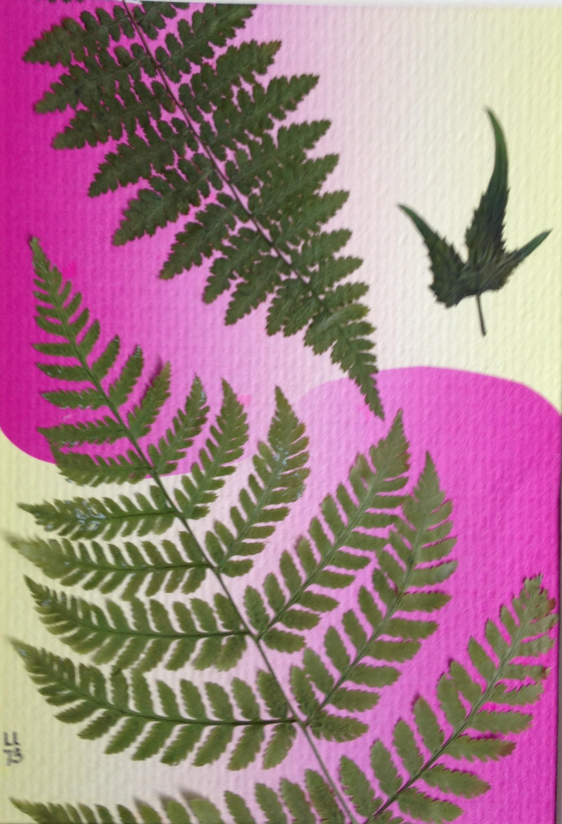
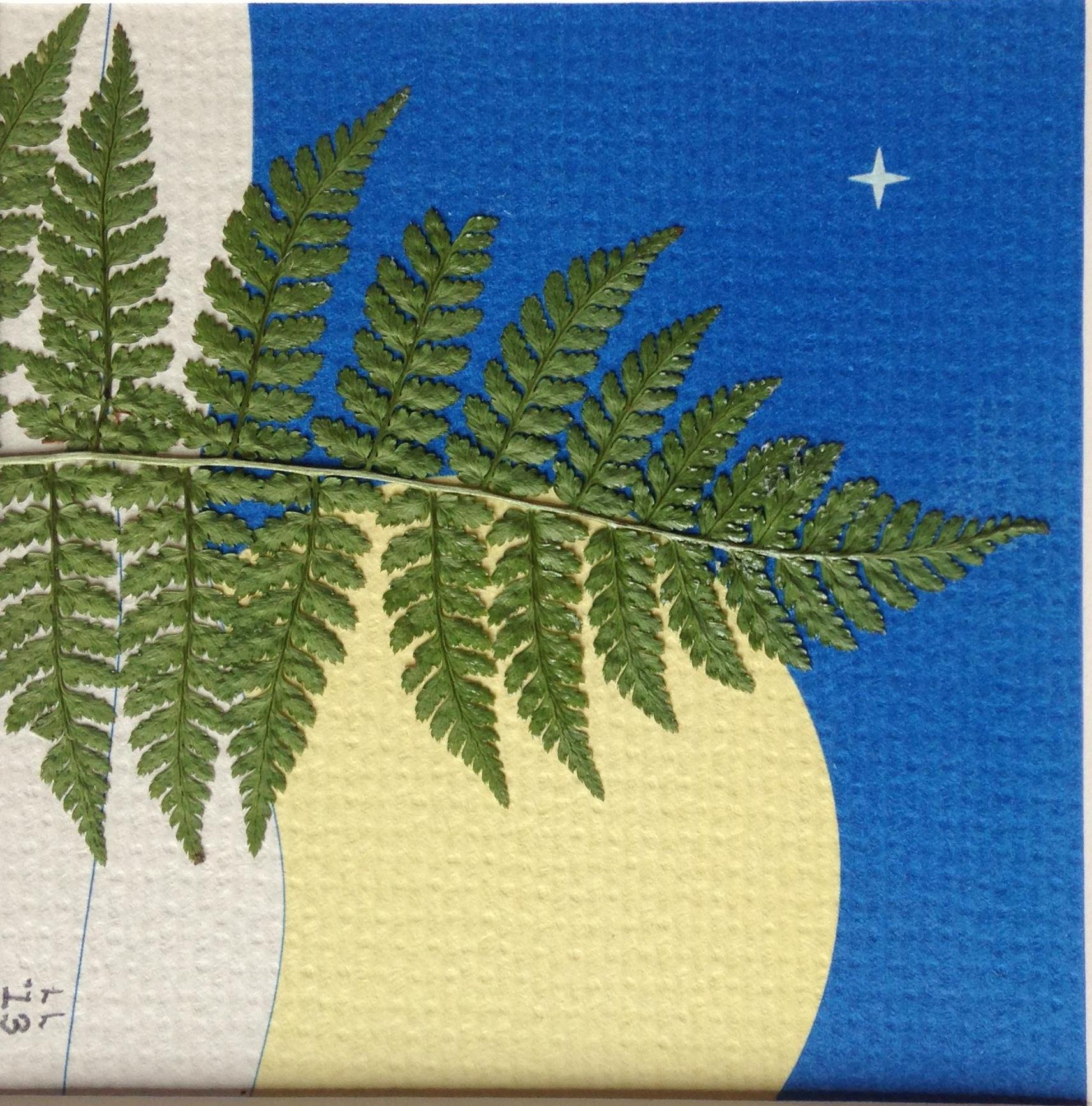
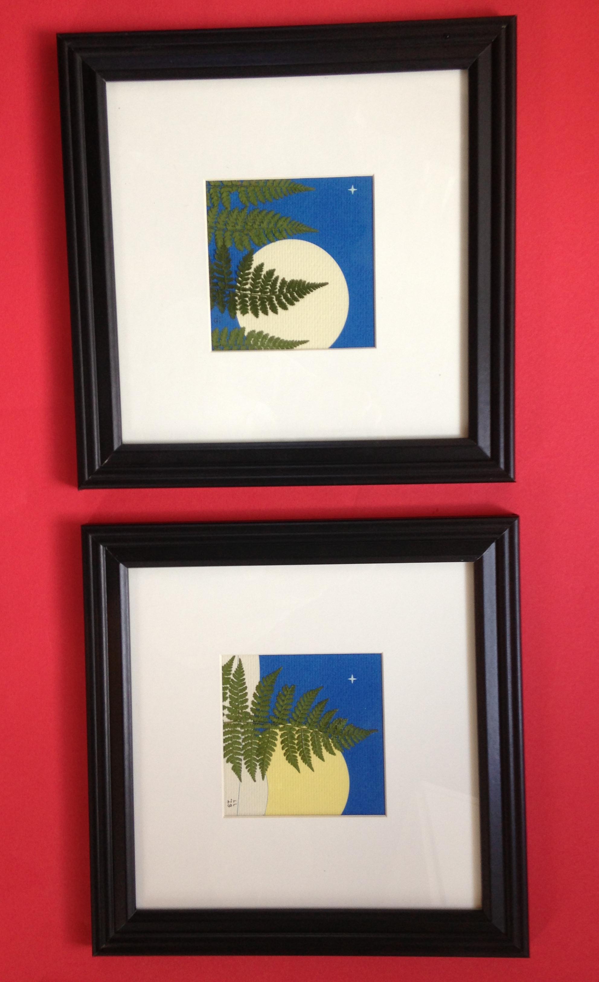
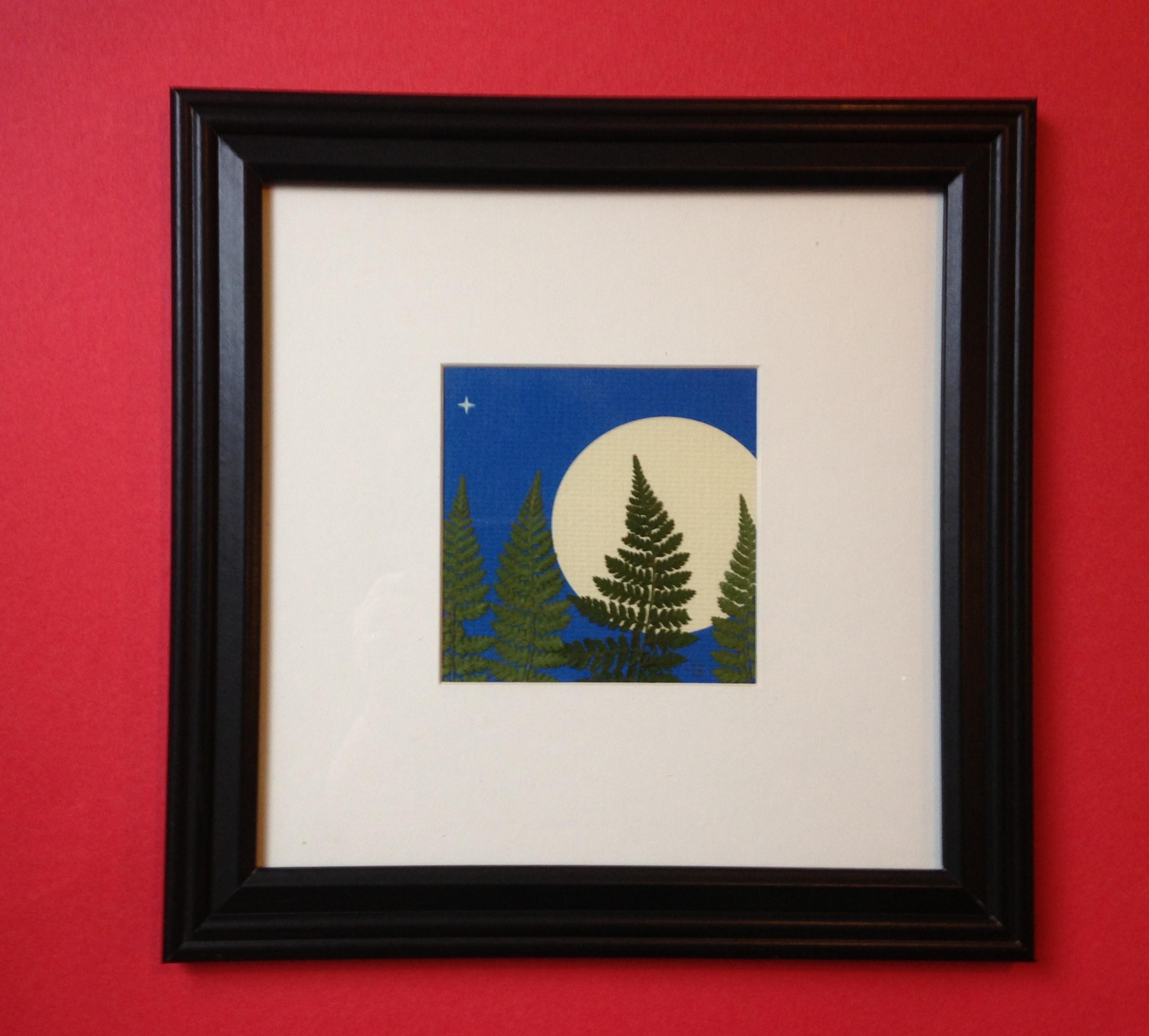
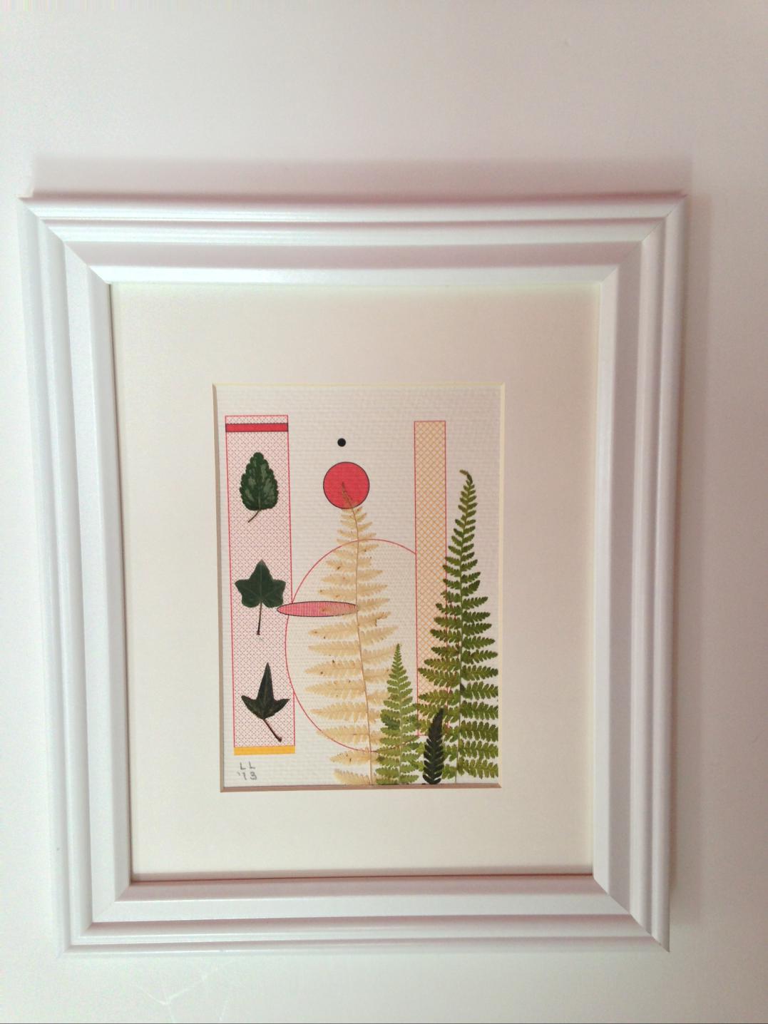
Within the second category are a lot of sub-categories. For instance, some of my more contemporary graphics– especially those I use to support light grasses — are meant as the focal point of the composition with the grasses serving as enhancement only.
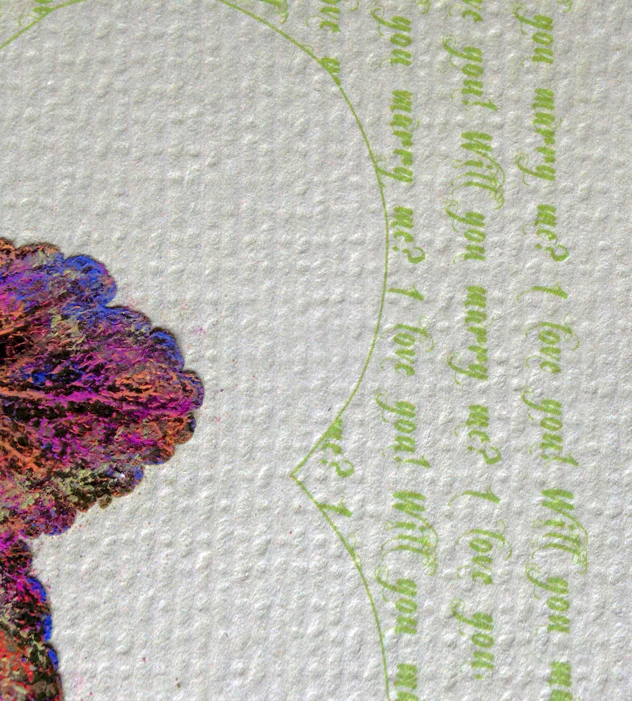
When I incorporate poetry or other text, on the other hand, I present it in a way that allows it to disappear into the background on first inspection. Check out some examples at my etsy shop by the same name as my blog.